Case Study: Enhancing User Engagement on Freelancer.com
OVERVIEW
Freelancer.com, an online marketplace connecting freelancers with clients, boasts millions of users and job postings
Our challenge? A high abandonment rate on the How It Works page, leaving important questions unanswered.
HIGHLIGHTS
By redesigning the How It Works page to cater to both freelancers and employers, we significantly boosted freelancer sign-ups and employer engagement.
My Role
Product Designer
Team
Product Manager
Product Designer
Software Developer
QA Engineers
Data Scientist
Process
Quantitative Analysis
Competitor Analysis
Prototyping
A/B Testing
Tools
Sketch
Balsamiq
Adobe Illustrator
CONTEXT
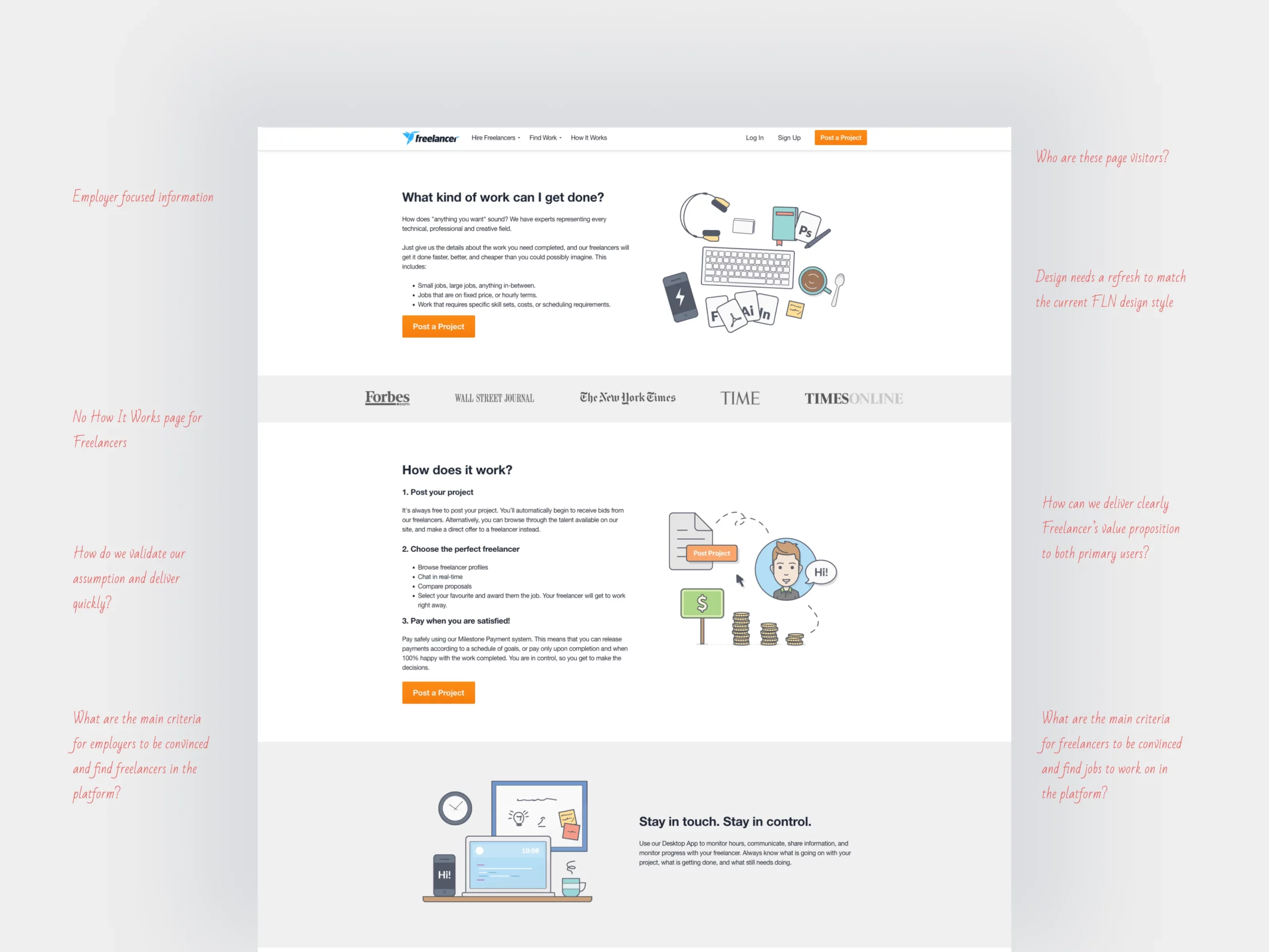
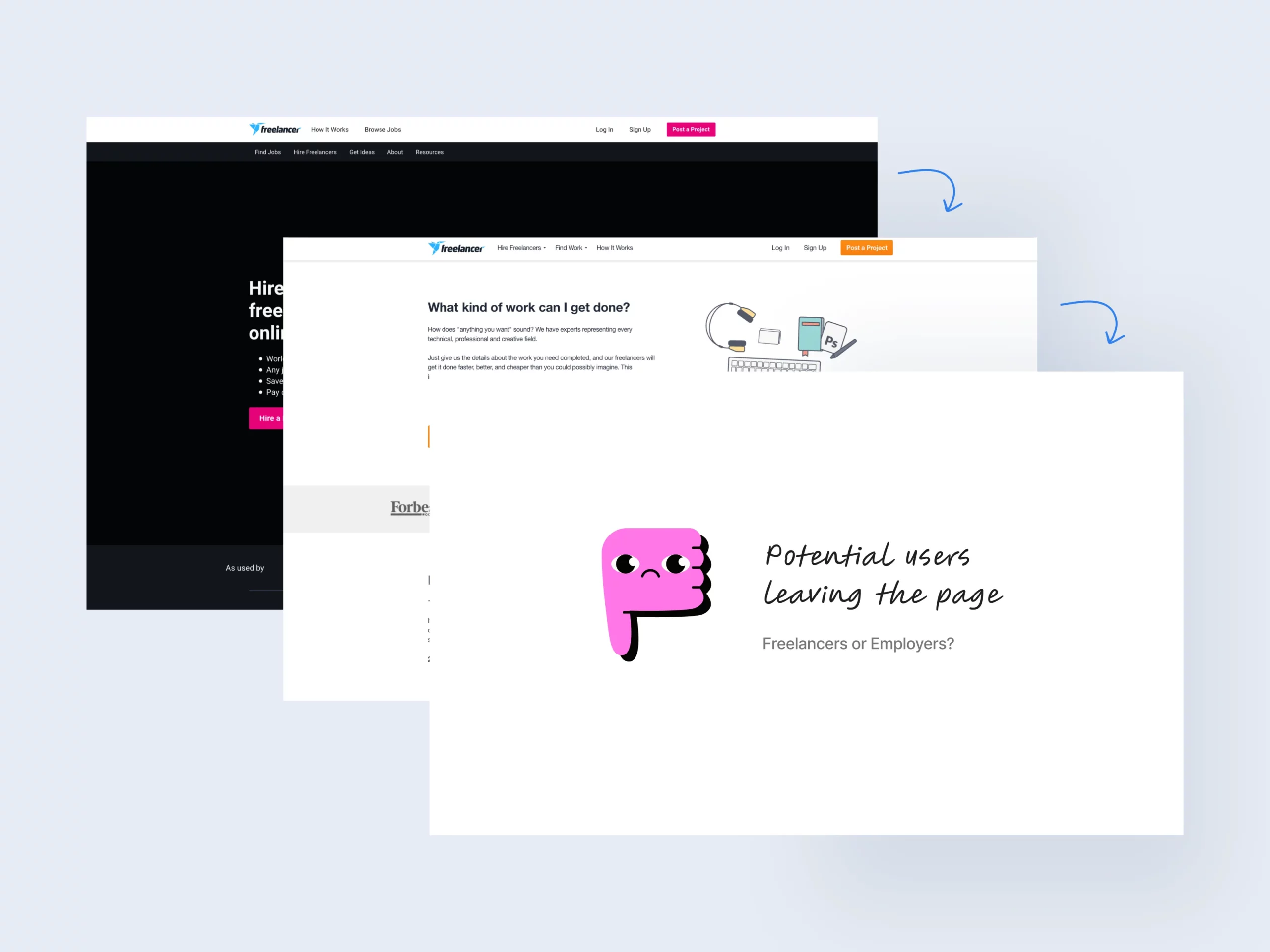
Freelancers visiting the How It Works page weren't finding the information they needed.
This results in a frustrating experience and high abandonment rates, particularly among logged-out users.
PROBLEM
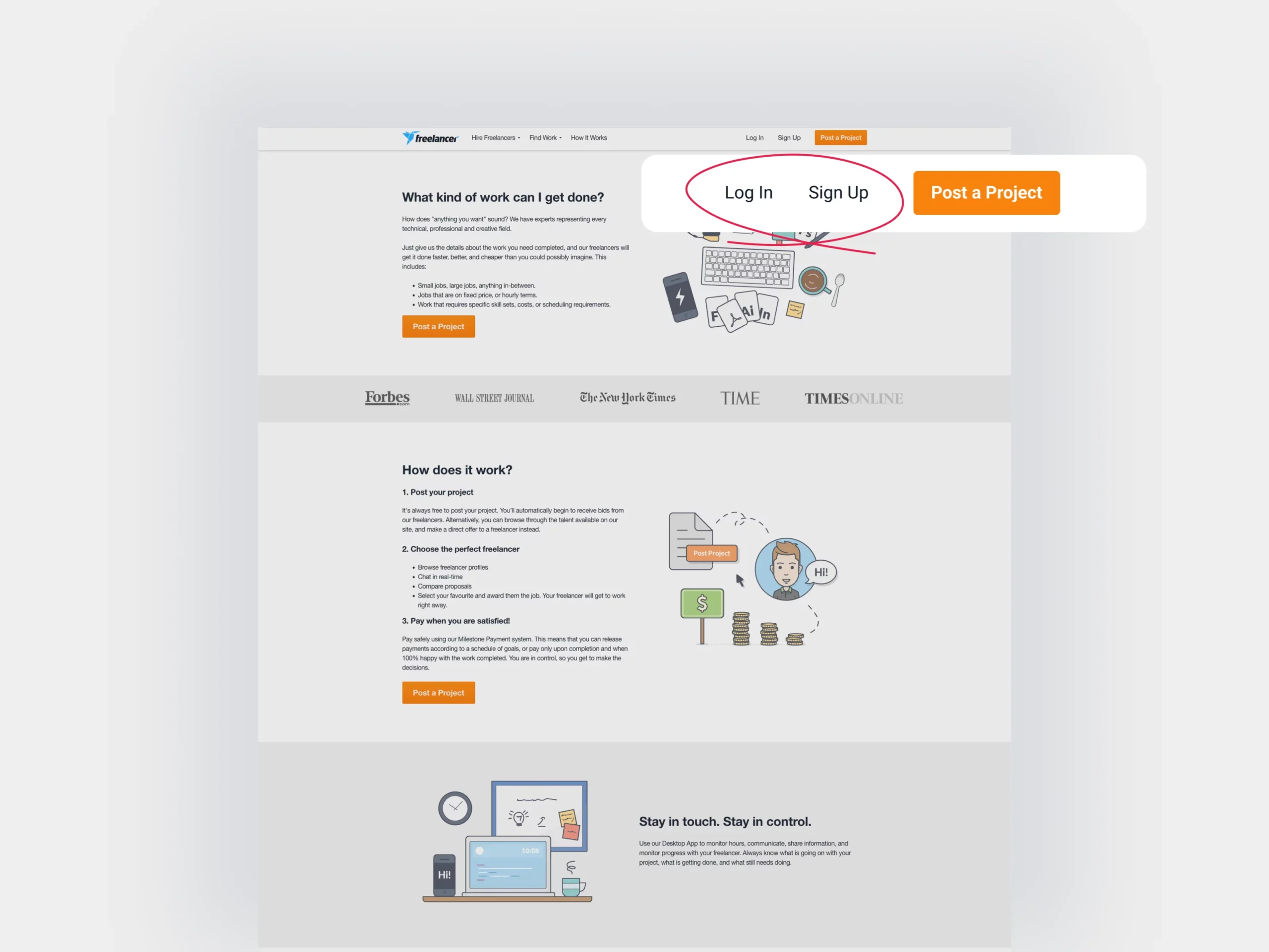
Distinguishing between prospective freelancers and employers among logged-out users was a hurdle.
Our goal was to quickly provide a solution that could be tested through an A/B test, verifying our assumption that most users were freelancers seeking information, and the page’s employer-centric content was driving them away.
MEASURE
To gauge the product's success, we tracked the number of freelancer and employer sign-ups originating from the page.
We continued to track these metrics in the page and compared the data between the two designs.
DESIGN PROCESS
Discover problems through quantitative data
- As a data-driven company, we relied on quantitative data to guide our actions. The How It Works page, frequently visited by new or potential users, was a prime focus.
- A hypothesis emerged: users left due to a lack of relevant information for freelancers.
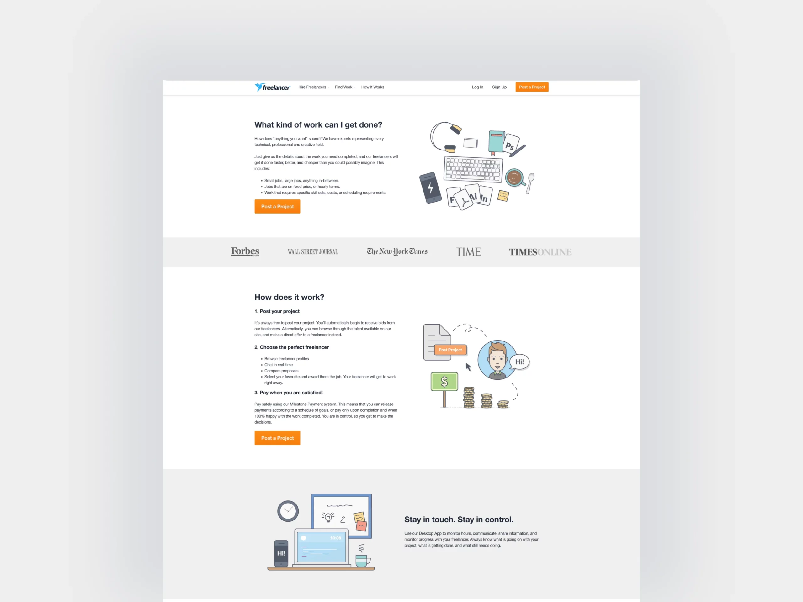
Understand the current processes
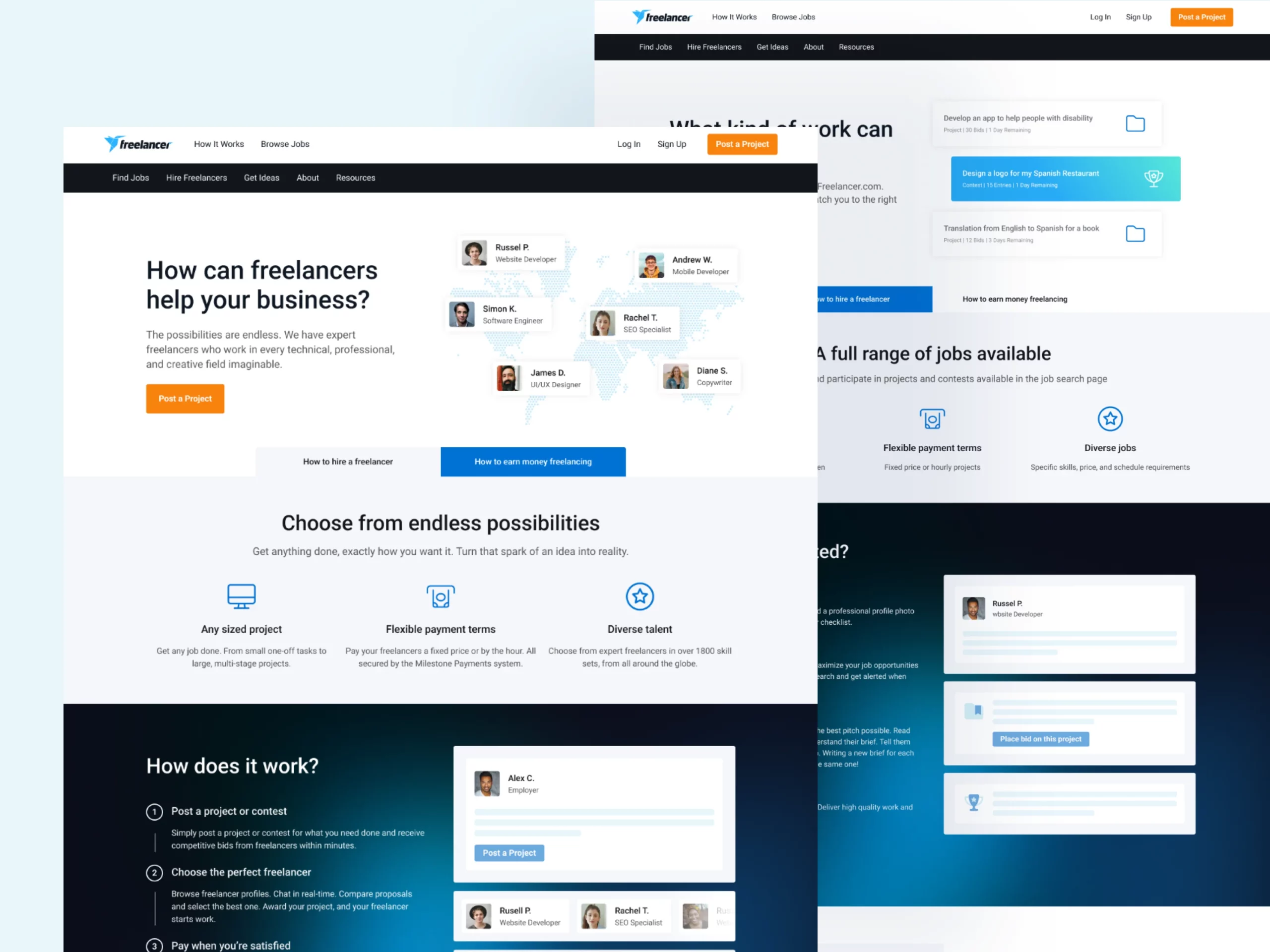
To effectively convey the value proposition to both employers and freelancers, it’s crucial to grasp the existing process. I delved into the current workflow, breaking it down into straightforward steps that are easily understandable for users. This streamlined approach ensures clarity and makes it effortless for both parties to comprehend the process and its benefits.
KEY DISCOVERY
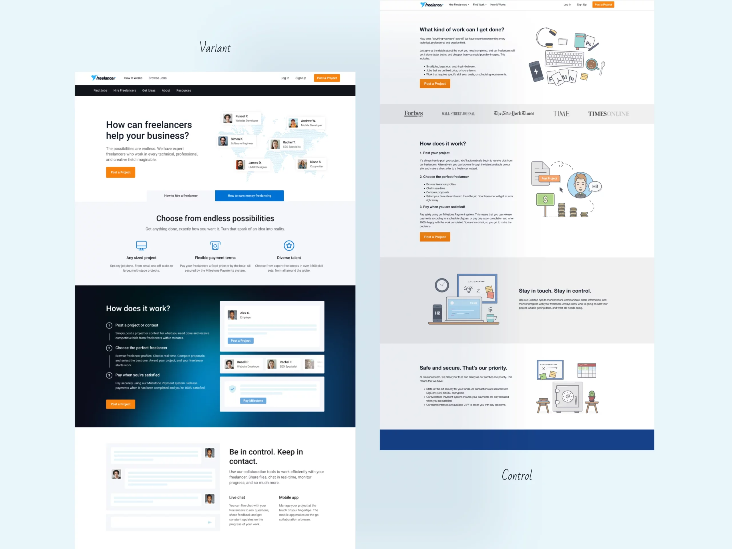
An A/B test revealed that our variant significantly increased sign-ups and project postings on the page, leading to its full deployment on the live site.
DESIGN
Offer a balanced solution
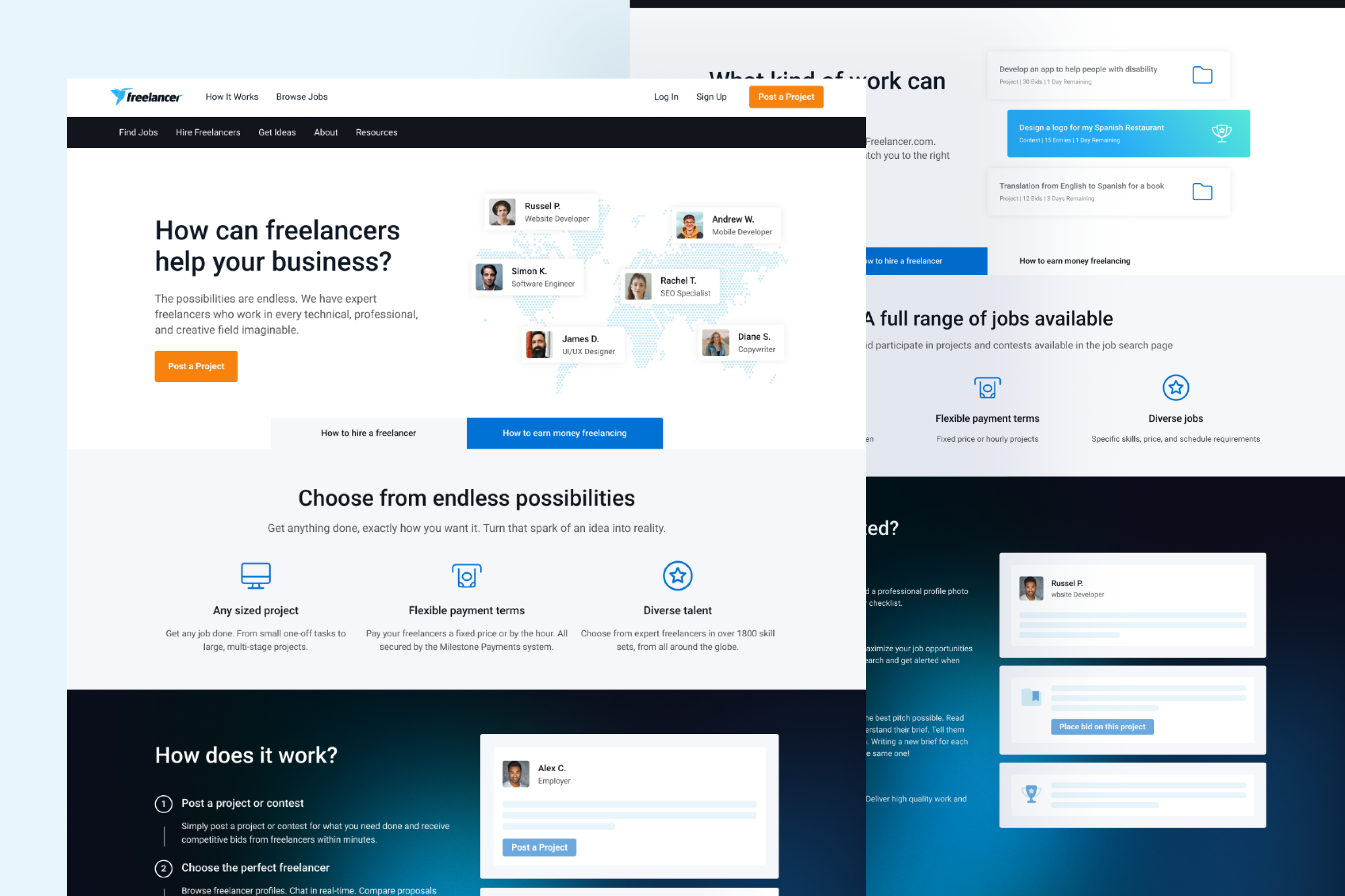
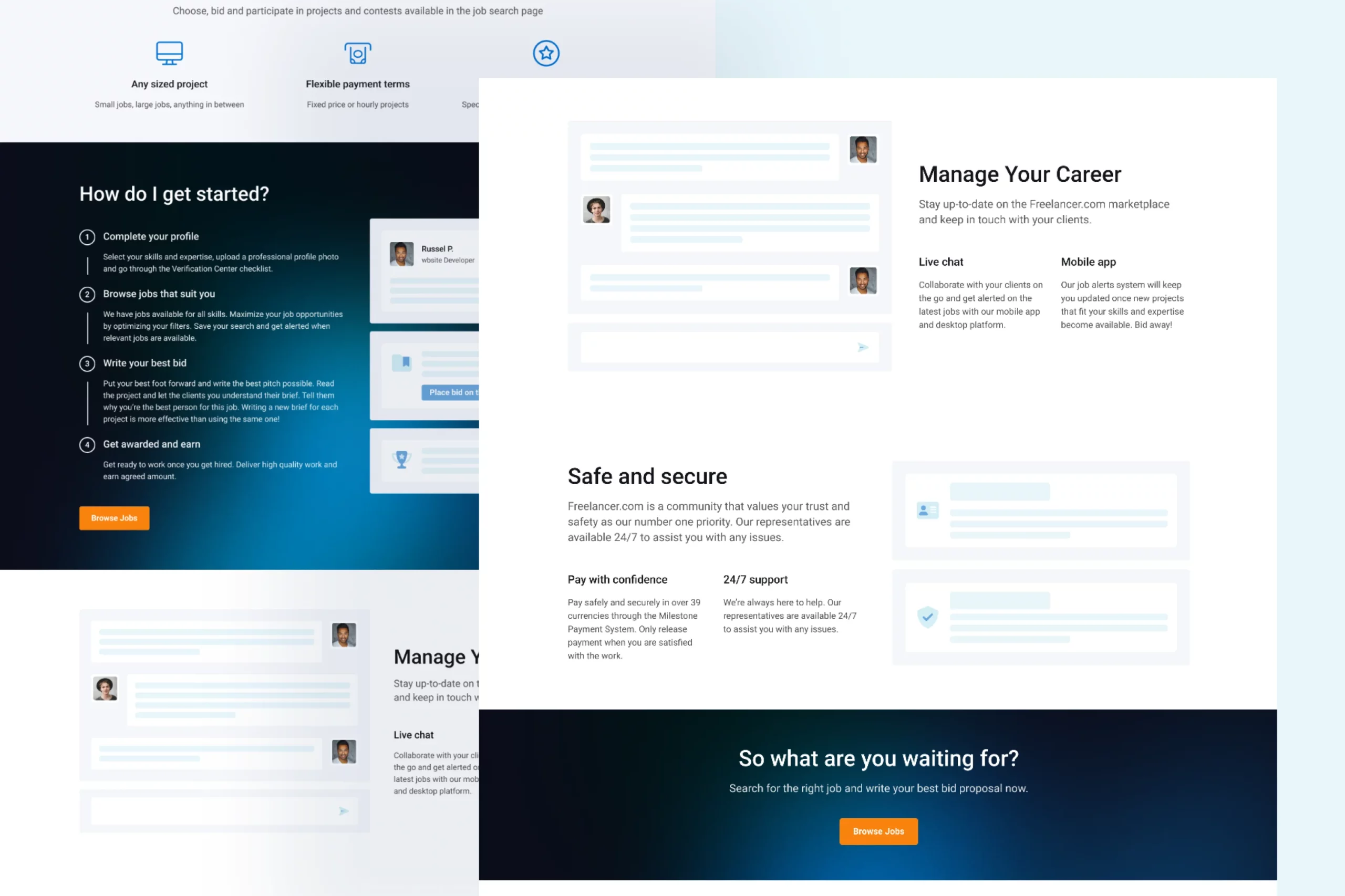
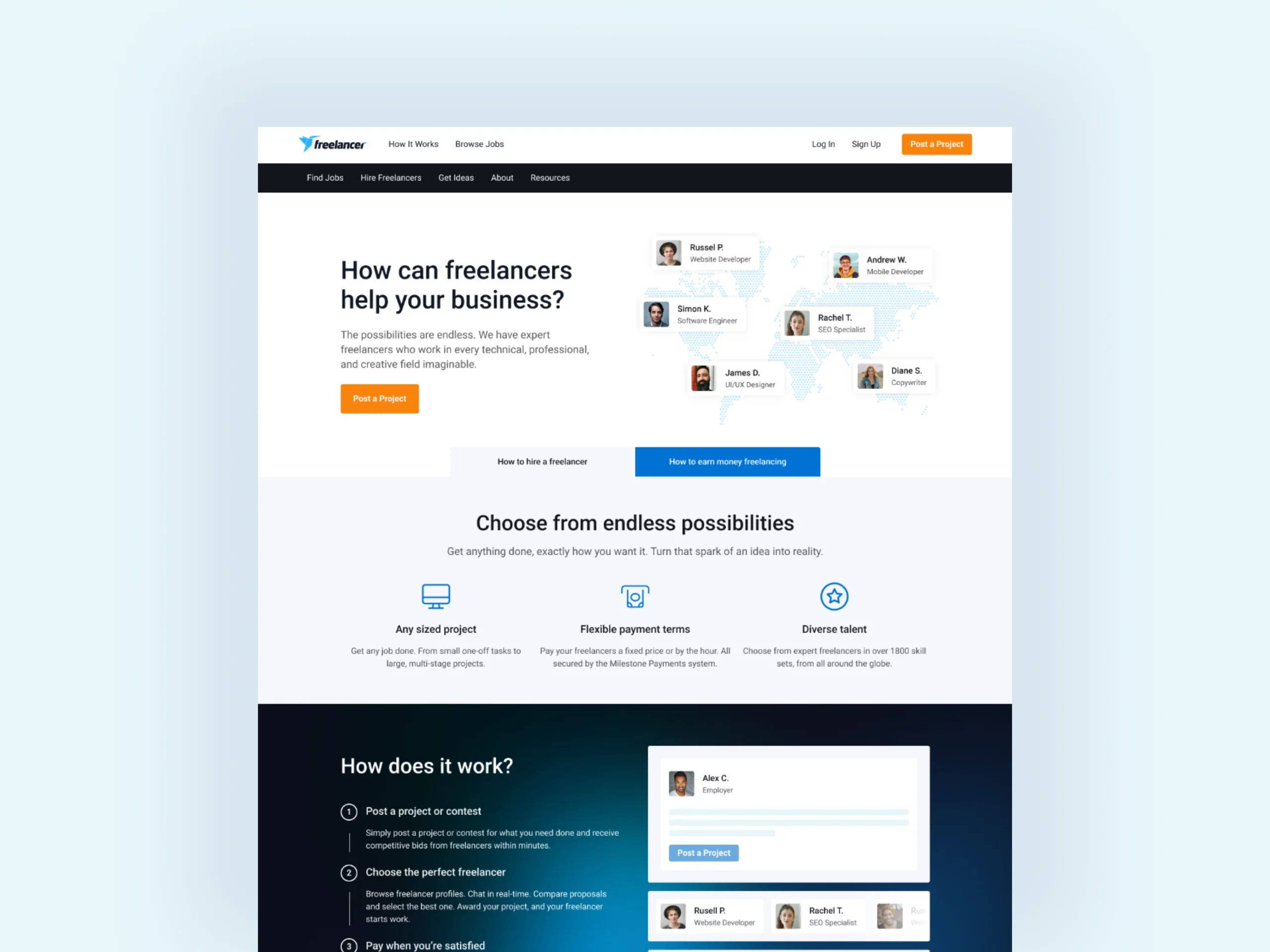
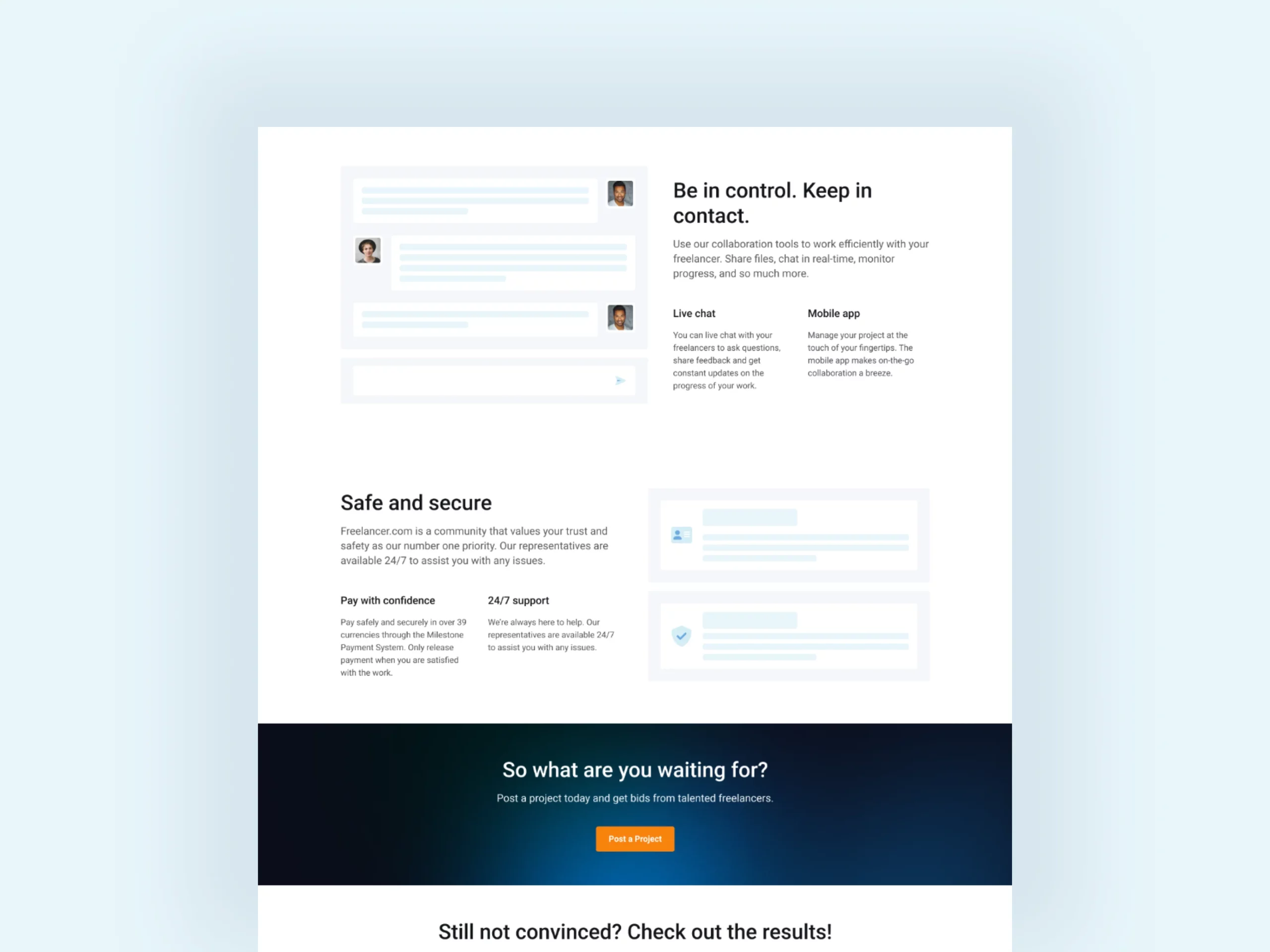
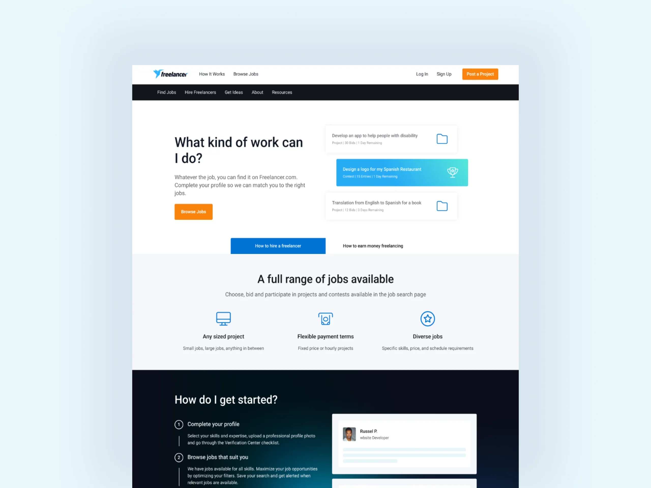
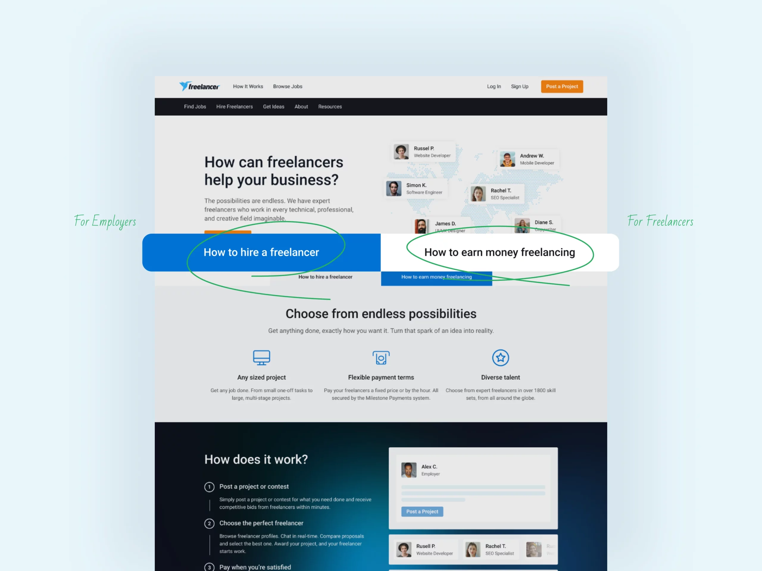
- We introduced a toggle-switch to switch between content tailored for freelancers and employers.
- For employers, we highlighted the benefits and ease of posting jobs, showcasing freelancer samples.
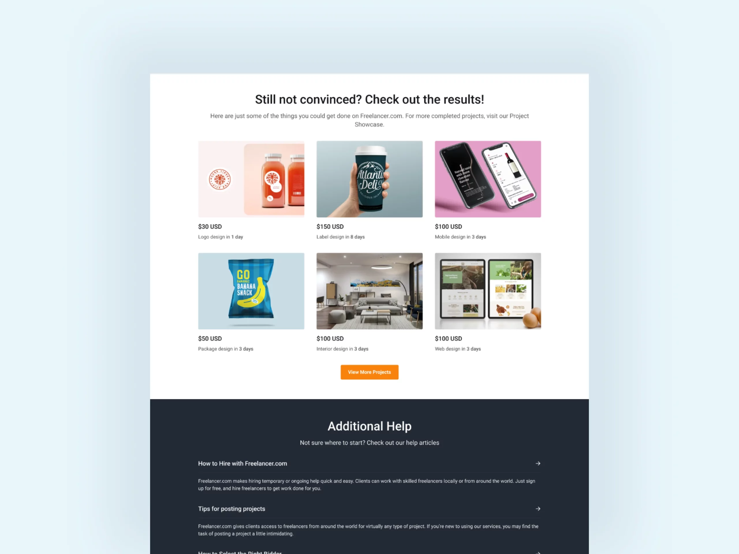
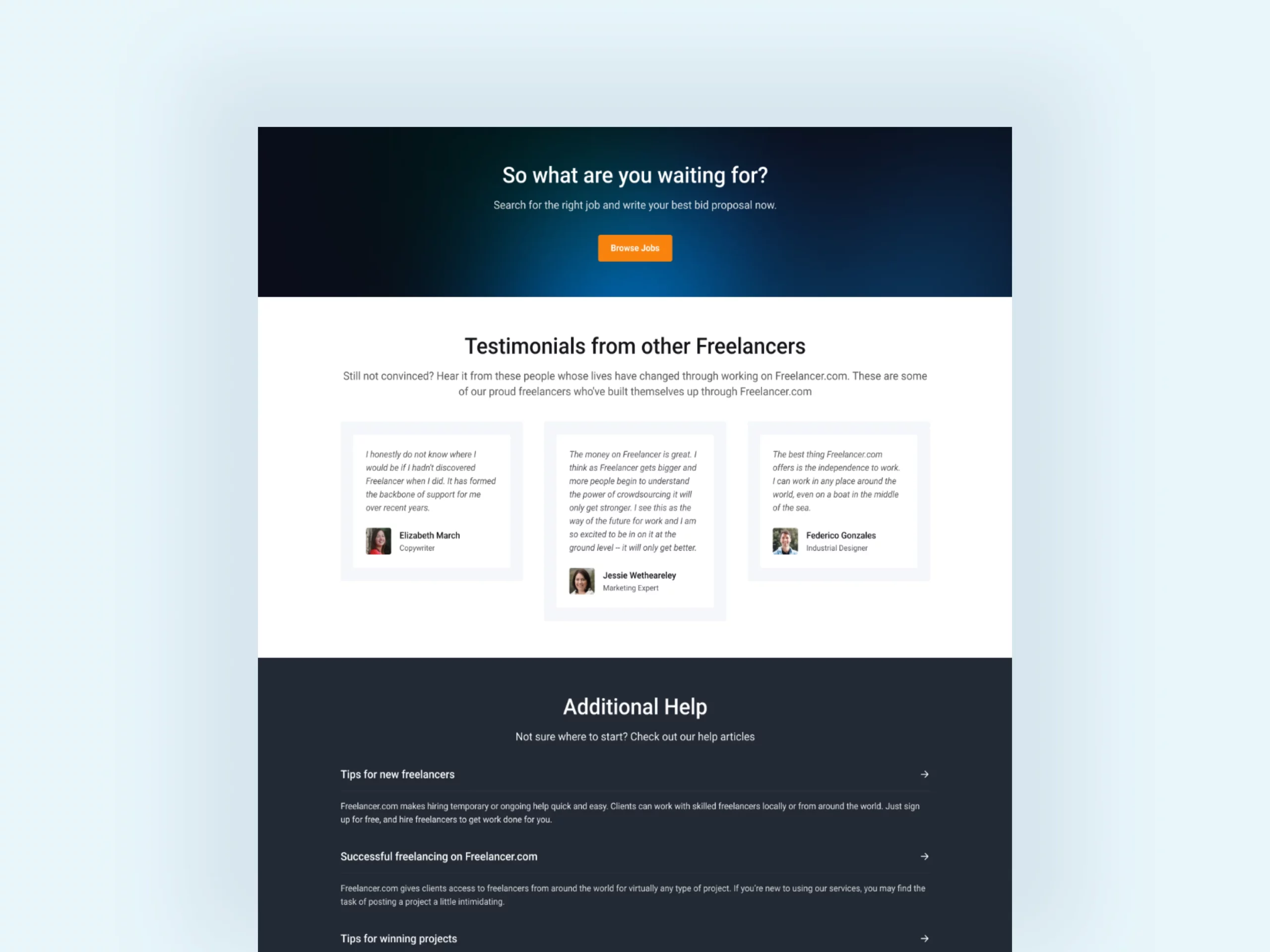
- For freelancers, we emphasized the ease of finding work, accompanied by testimonials and case studies.
RESULT
We created a clear value proposition for both freelancers and employers, addressing fundamental questions that encouraged them to sign up.
We significantly boosted freelancer sign-ups and employer engagement.
RETROSPECTIVE & LESSONS LEARNED
While the redesign was successful, there are still improvements needed in the process:
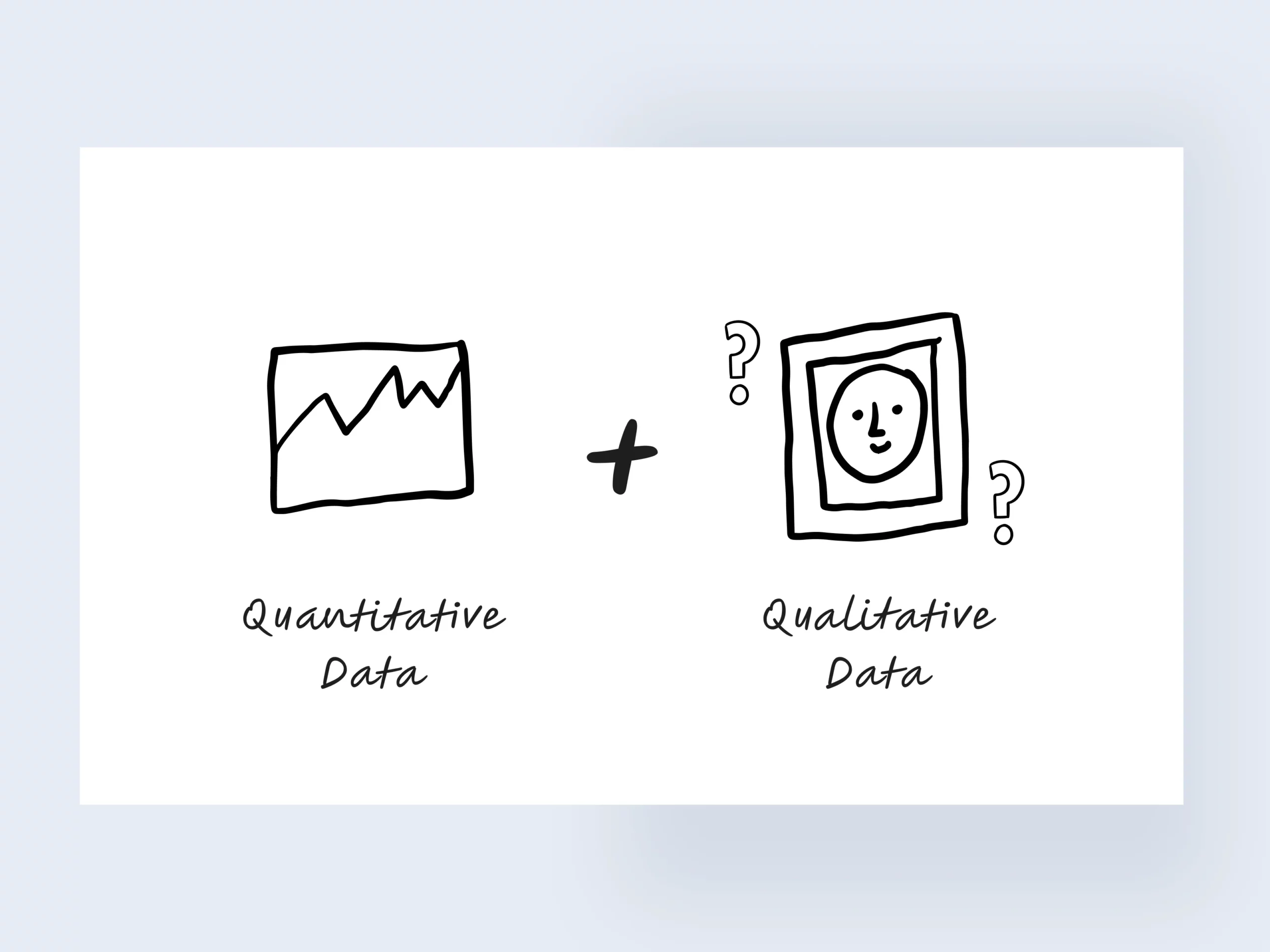
- Combine quantitative and qualitative discovery to create a more robust hypotheses. We only relied on quantitative data, being a data-driven company. We could create a more informed decision if we conducted qualitative research.
- Explore input from support tickets and customer support chats more to avoid relying on assumptions.
- Depending on the timeline, introduce a research plan to validate our assumption. Maybe a user testing would help and adding a simple survey question on the page for logged out users.