Transforming Healthcare Access: A Mobile App Design Case Study
OVERVIEW
Doctoranytime is a leading health tech company in Greece, Belgium, and expanding in LATAM. They assist people daily in finding the right medical services, offering guidance on health matters and connecting them with the right practitioners conveniently.
In our mission to enhance lives and boost holistic well-being, I led the end-to-end design of the mobile app.
Our goal was to help users seamlessly find and book medical appointments through the mobile app, marking a significant milestone in our mission to become a comprehensive healthcare companion. This initiative has paved the way for exciting ventures into telemedicine and proactive healthcare initiatives, unlocking new possibilities.
HIGHLIGHTS
We achieved double the conversion rate compared to the web application.
We also witnessed a steady upward trajectory in the retention rate.
My Role
Product Designer
Team
Product Manager
Product Designer
Mobile Tech Lead
Mobile Developers
UX Writer
Process
Competitor Analysis
Stakeholder Analysis
Quantitative Data Analysis
Heuristic Evaluation
Ideation
Prototyping
Usability Testing
Evaluation
Tools
Figma
Figjam
Miro
Notion
Gmeet for Remote Testing
Amplitude
CONTEXT
Around 80% of our users are accessing the web app through their mobile phones.
We recognized an opportunity to enhance user experience and pivot toward a more product-centric approach by developing a mobile app.
PROBLEM
Despite a tight timeline, we lacked sufficient qualitative data to understand user pain points.
The challenge was clear: How could we ensure a superior mobile app experience compared to the web version, and what strategies could we employ to gain deeper insights into user pain points?
MEASURE
Success Metrics
- Install Base
- Average number of sessions per user per month
- Number of active users
- Conversion rate (appointment/session)
DESIGN PROCESS
Consider Important Questions
How can we address the lack of sufficient qualitative data? How can we help our users find suitable doctors? How can we convert these users to book appointments with our pool of practitioners?
Familiarize with the Current State
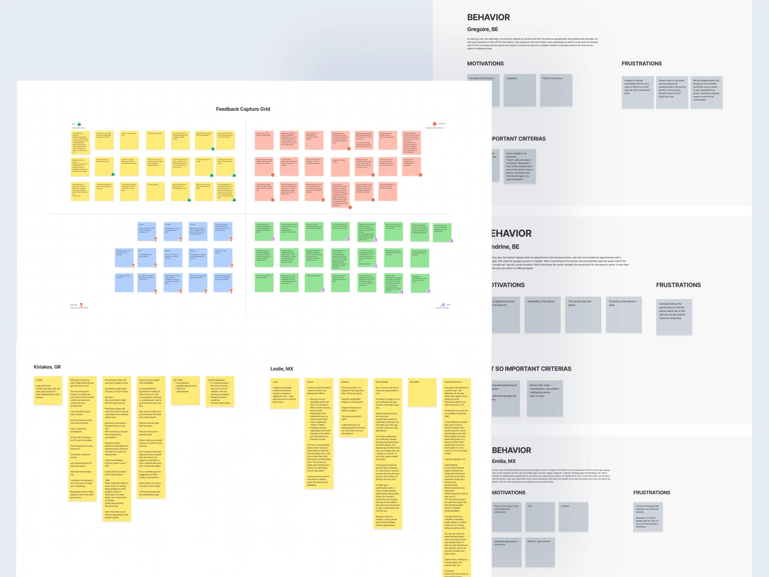
I conducted focused discussions with stakeholders, guided by the Product Manager, exploring past design decisions, user pain points revealed in customer support interactions, and more. Quantitative data analysis of the current web app from sources like Google Analytics, Crazy Egg, and Power BI supplemented this phase.
- Who are our users?
- What is the current flow existing users follow?
- How do users typically find practitioners?
- What are they looking for?
- What is the current conversion rate in terms of appointment bookings?
- Do we have any data showing where users drop off in the search and booking process?
Audit and Identify Usability Issues
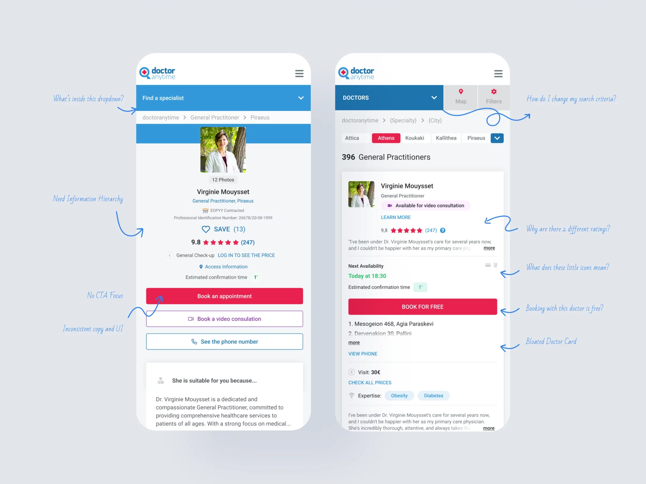
Collaborating with the design team, we performed a heuristic evaluation, uncovering key usability hurdles in the web app’s search process. This evaluation directed our attention to specific data points requiring prioritization.
- What are the main usability issues found from an experts' perspective?
- What can we fix right now? What can we fix later?
Conduct Desk Research
A competitor analysis helped me understand industry-standard booking processes and compare them to our platform’s current flow.
- Who are our main competitors?
- What are their pain and gain points?
PRIORITY
Simplify the Search and Booking Process
Leveraging insights from the research, I revamped the mobile app’s design structure. With the team, we identified the optimal flow needed to start with a prototype so that we can get feedback from the end-users. At this point, the design improvements were highly-based on expert reviews. We lack input from the end-users.
Test and Optimize the Proposed Solution
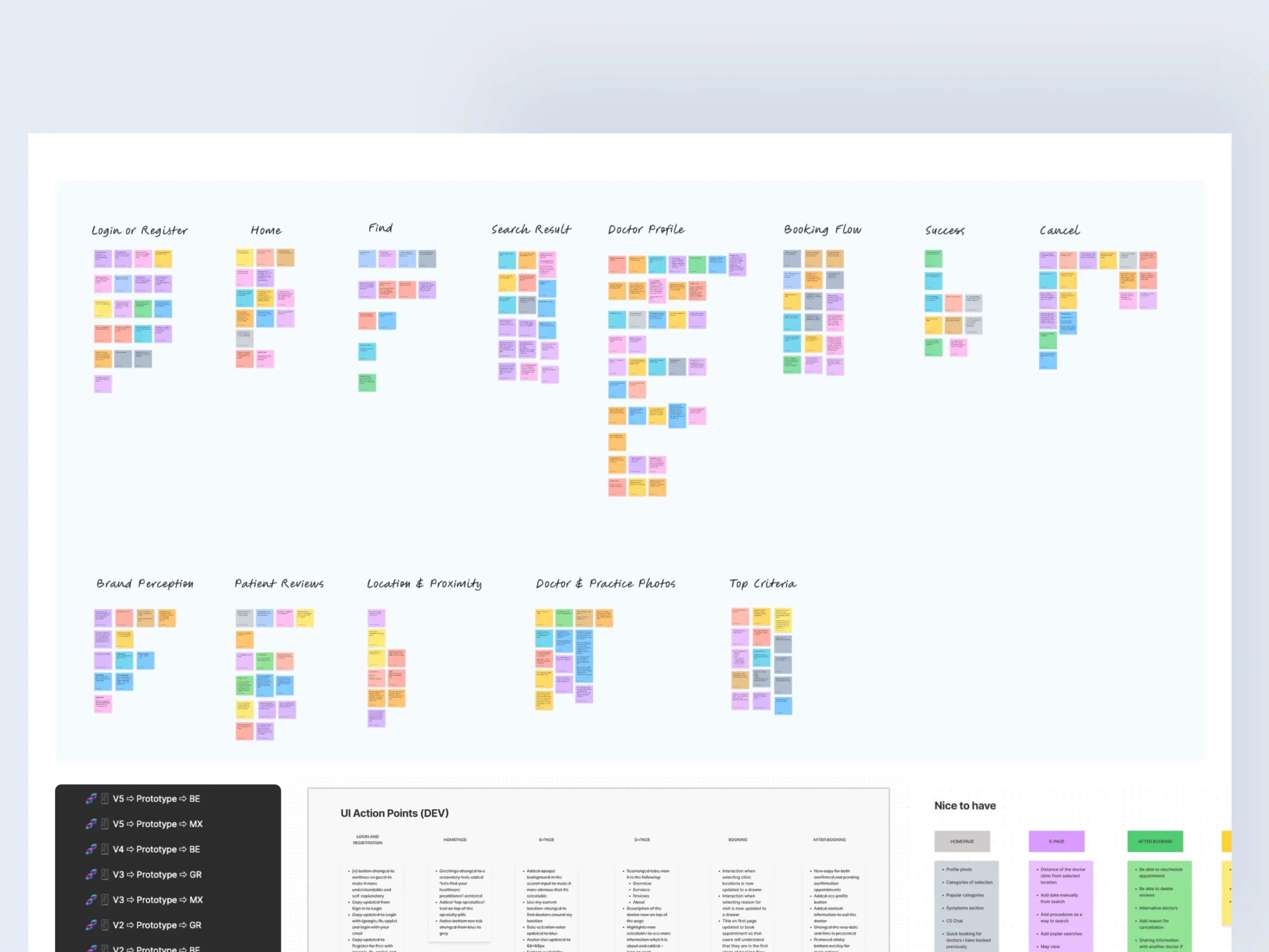
The mobile app underwent rigorous testing in diverse markets, evolving through iterations until we were confident in its readiness. It took us six iterations of prototypes created in Figma before we released a beta test of the product to a small sample of users.
- Internal Usability Test: Initial testing identified potential usability issues with the help of colleagues familiar with the product.
- External Usability Test: Further tests were conducted with real users, targeting individuals within the typical user demographic, particularly women and tech-savvy individuals. We conducted usability tests for three different domains (Mexico, Greece, and Belgium)
- Soft Launch: It was released first in Mexico as a soft launch to get more feedback to a small sample of users.
KEY DISCOVERY
Through this process, we gained a better understanding of users' top five criteria when choosing a practitioner.
The main criteria are: Price, proximity, availability, reviews, and photos. The surprising impact of practitioner photos on user decisions was a noteworthy revelation.
DESIGN
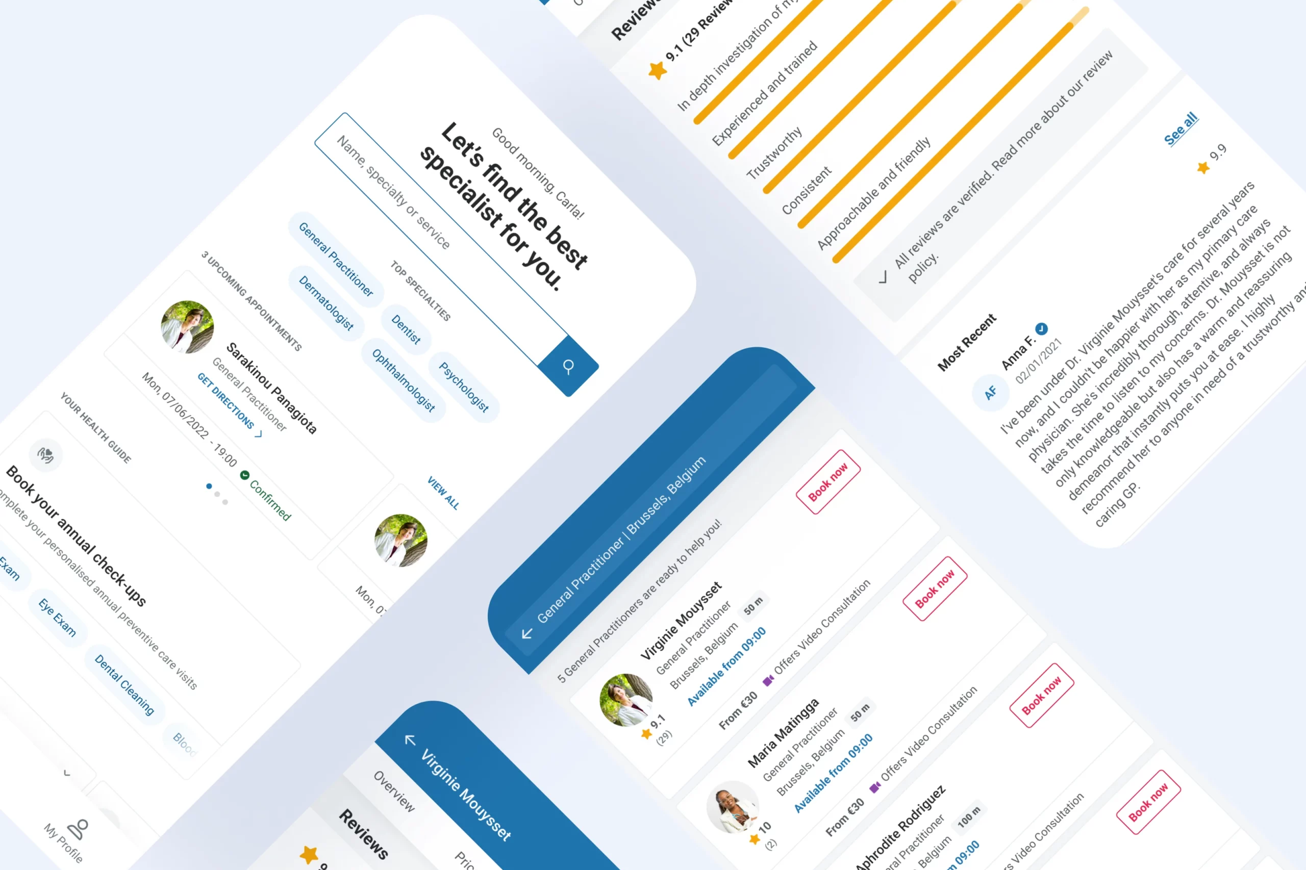
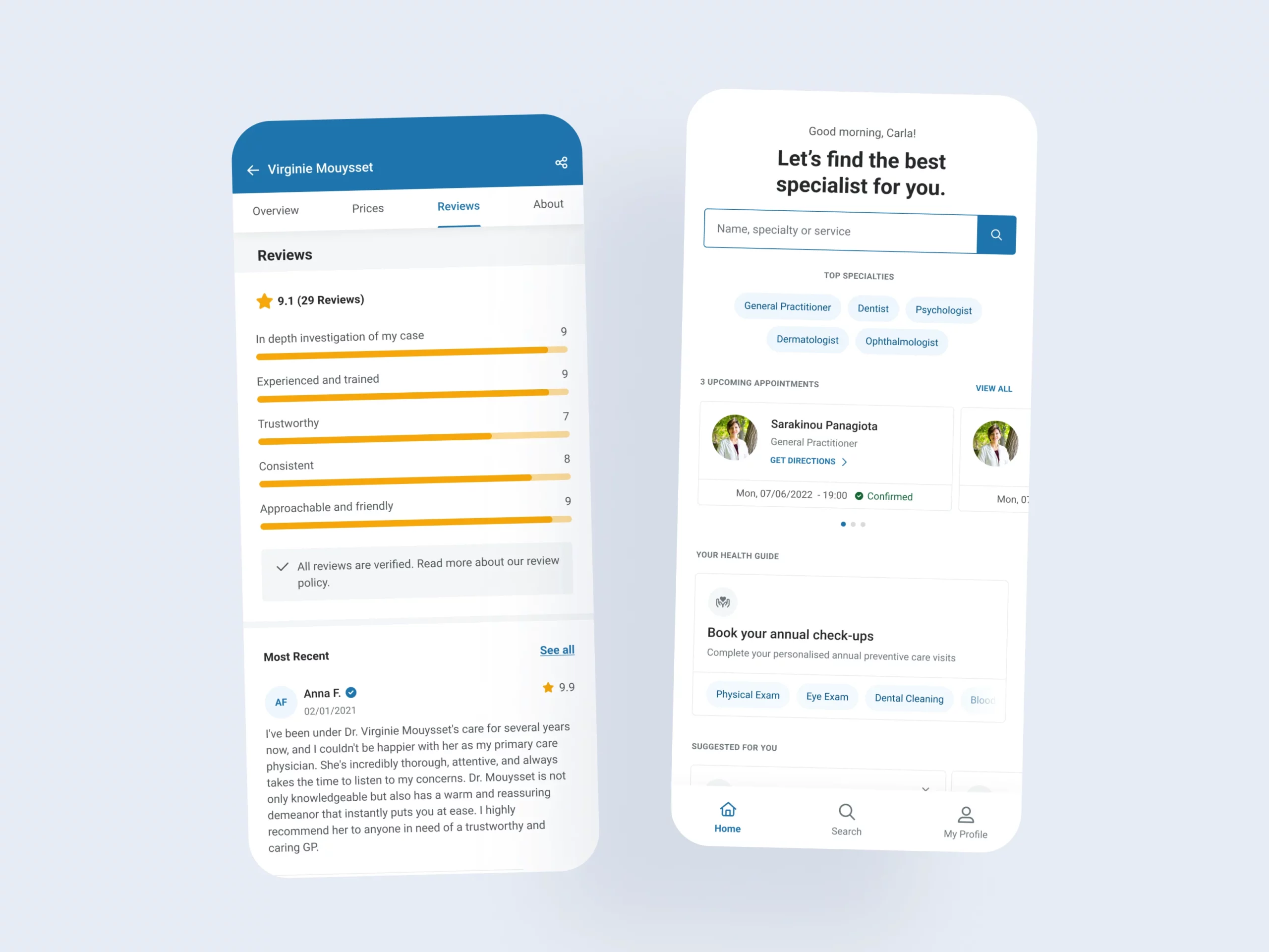
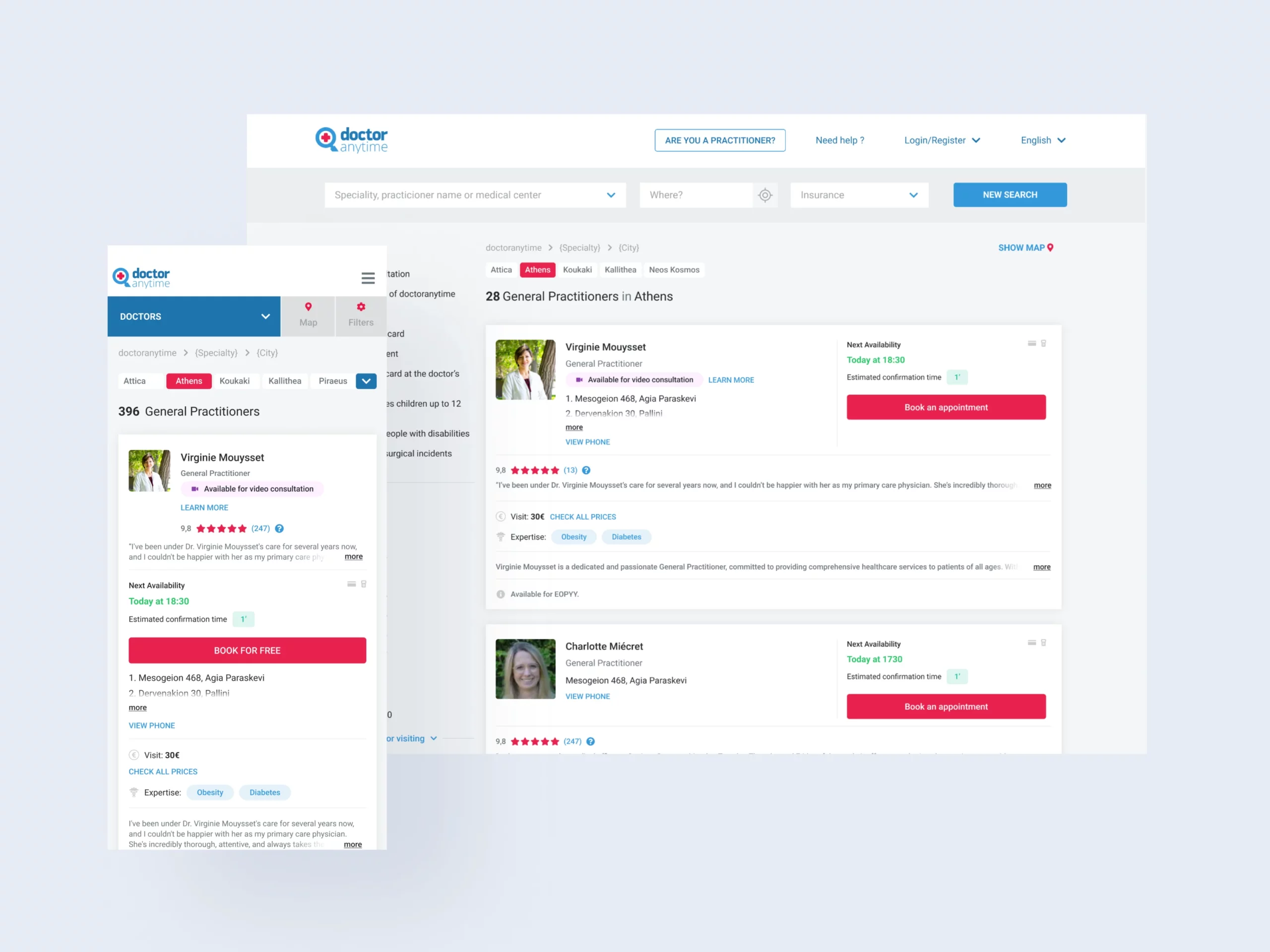
A more compact and valuable search result
The goal of the app was to provide what users are looking for when searching for a doctor. So I arranged the content according to the five factors users consider when selecting the appropriate practitioner. This approach empowered users to make well-informed choices directly from the search results.
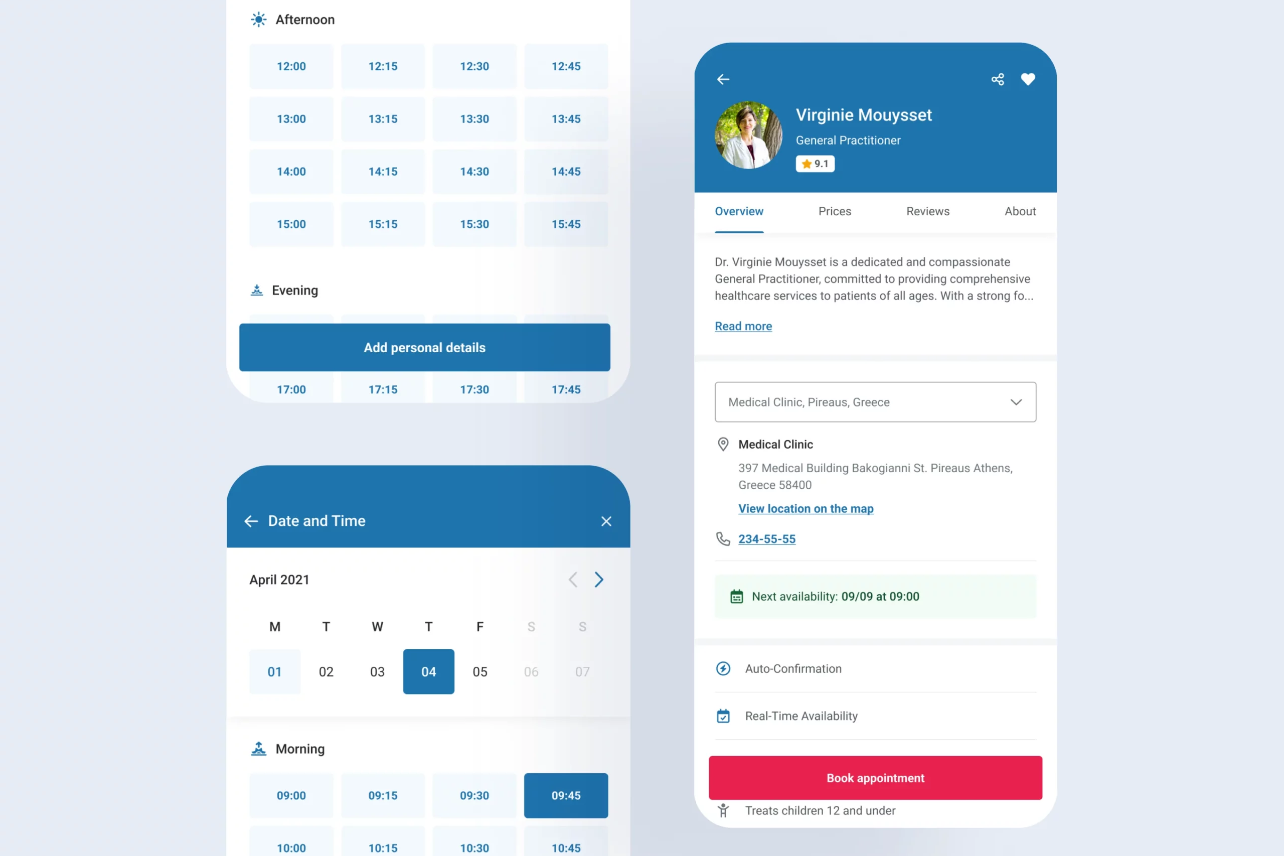
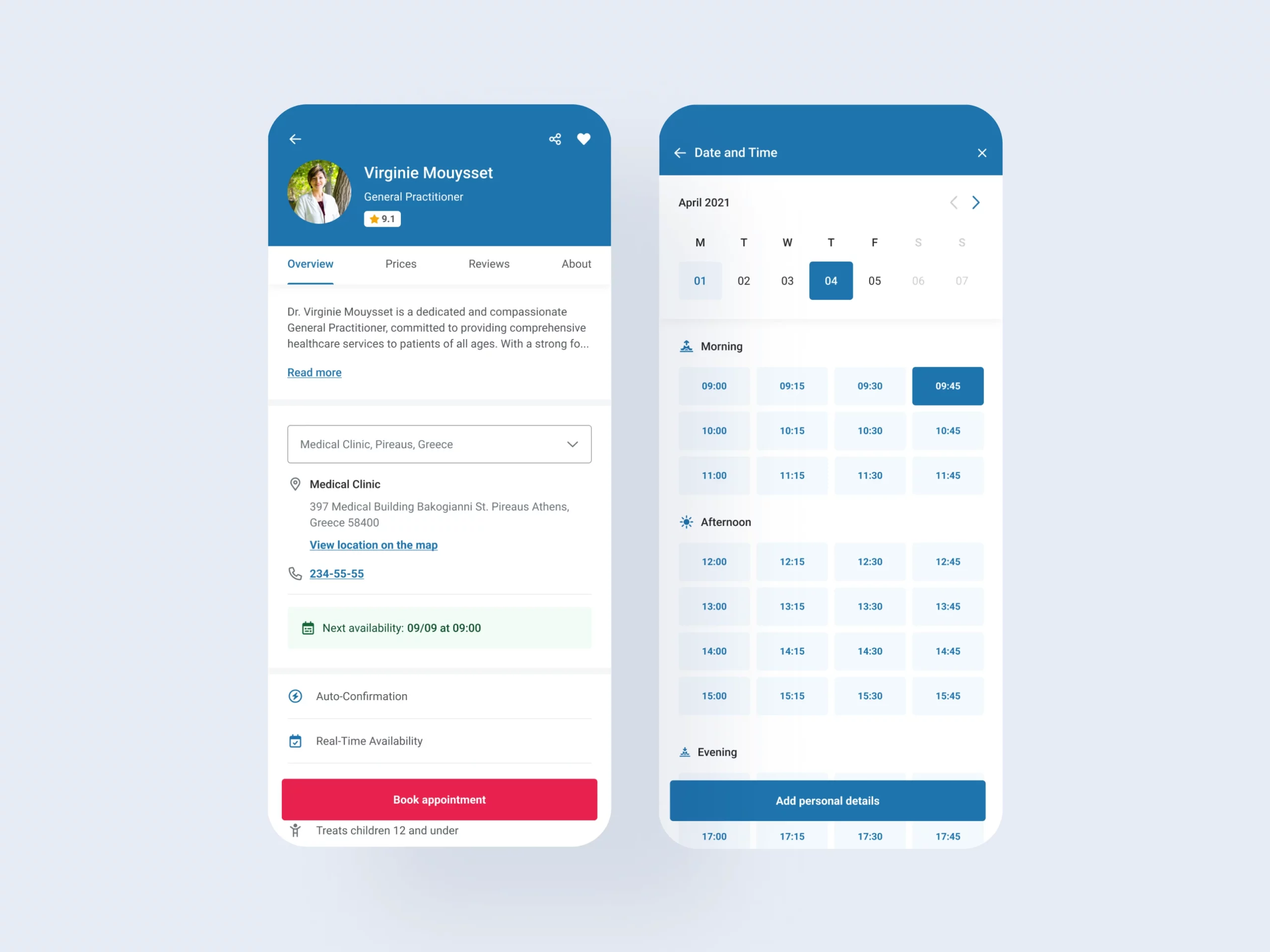
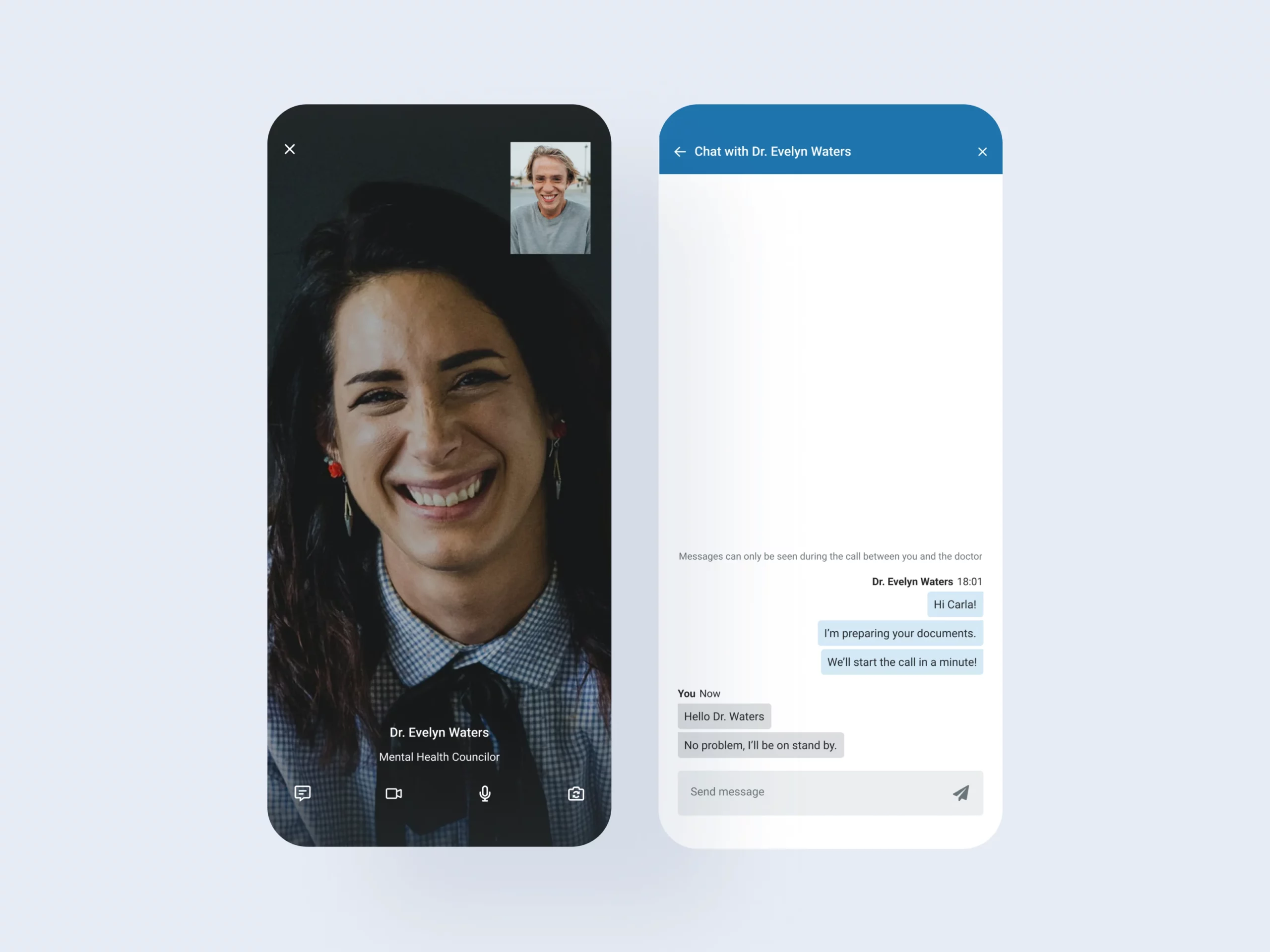
A simplified booking experience
The research showed no major usability issues in the booking process, with most participants finding it straightforward. We made minor adjustments, mainly related to post-appointment reminders sent to patients.
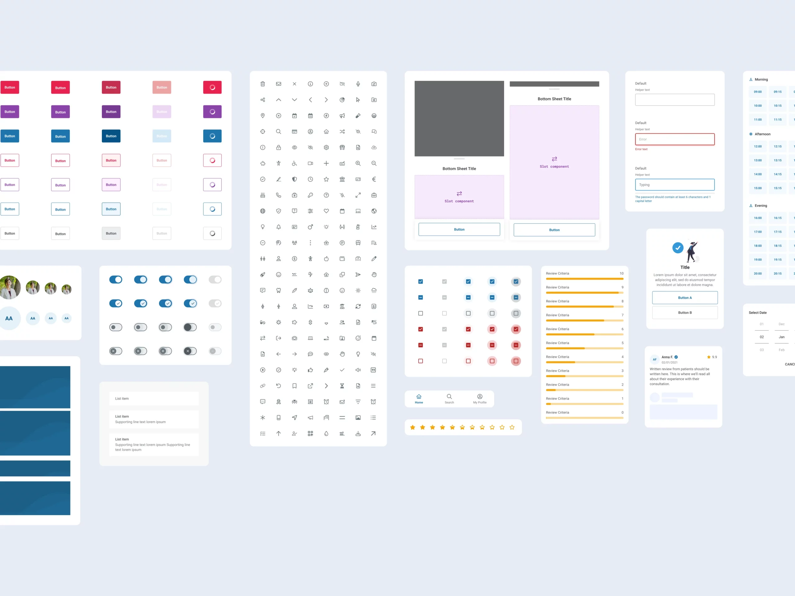
A Robust Mobile Design System
During the design phase, I created reusable components and a design system to ensure scalability, consistency, and maintainability.
RESULT
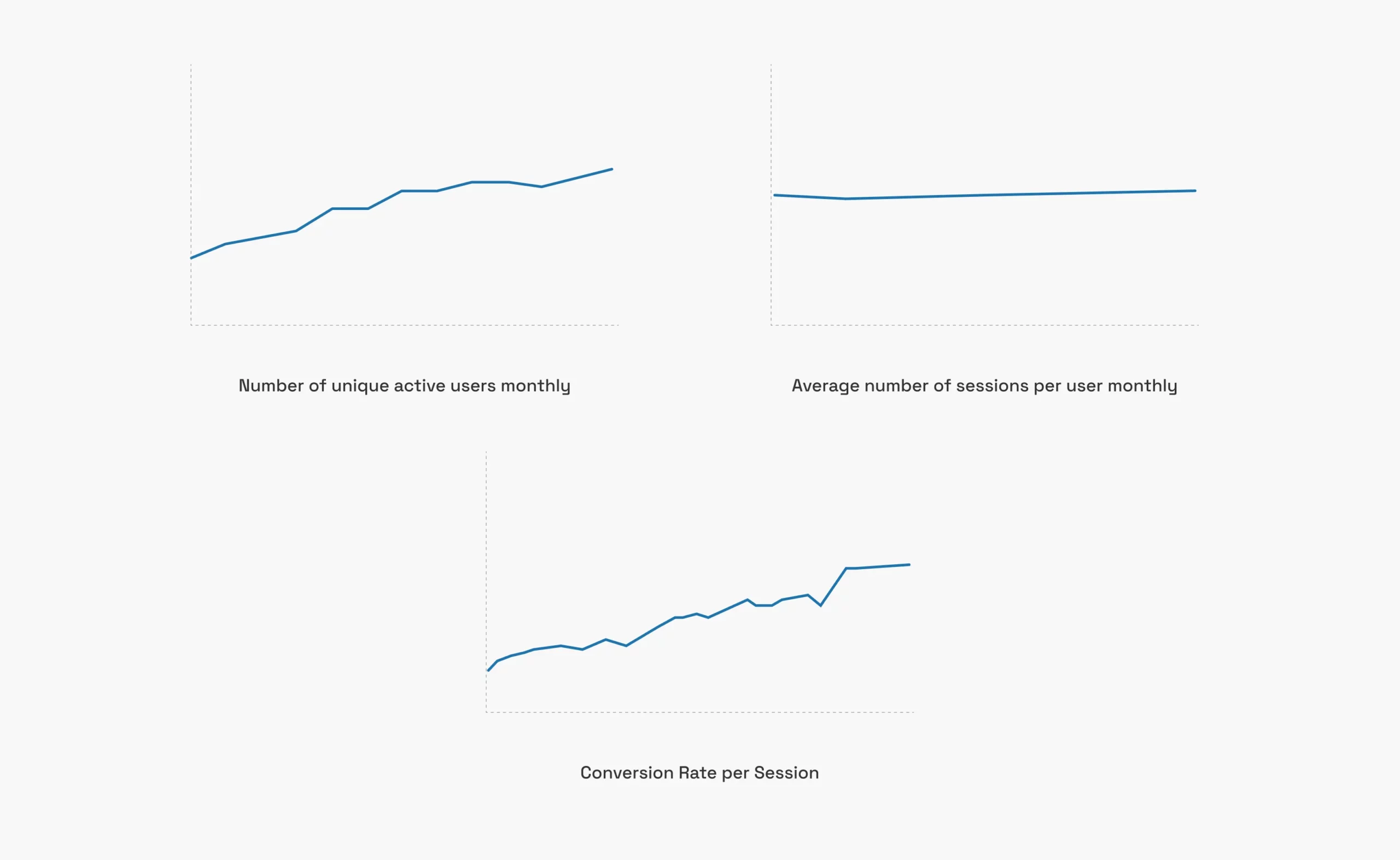
This approach led to a conversion rate twice that of the web app, with retention rates remaining robust despite a growing user base.
- The user base on both iOS and Android is gradually growing, even without any product marketing efforts. Currently, the team is actively developing initiatives to drive more users to the mobile app.
- Average number of sessions per user per month is at a steady phase.
- Average number of unique active users monthly increased by 170% after a year of release.
- The conversion rate (appointment/session) is double that of the web app.
RETROSPECTIVE & LESSONS LEARNED
Areas for improvement:
- Leverage existing data for a more data-driven approach. Create better data tracking process with the team. We didn't have enough data to support a lot of things. This prompted the mobile team to use Amplitude for quantitative data once it is released.
- Implement faster stakeholder research, possibly through methods like stakeholder surveys. We were blocked at some point because we need to talk to stakeholders. Other ways like surveys to get their input could be valuable so that they can provide answers whenever they want.
- Create a clear research plan involving team members to expedite buy-in.
- Continue engaging users throughout the design process. Early involvement through surveys, interviews, or usability tests can identify nuanced pain points.
- Incorporate accessibility considerations into UI design from the beginning of the project.